03.13.23

The Language of Visual Art: When Words Aren’t (or Are) Enough

In conversation with Courtney Faye Taylor, Gabrielle Bates, and Monica Ong

The Language of Visual Art: When Words Aren’t (or Are) Enough

In conversation with Courtney Faye Taylor, Gabrielle Bates, and Monica Ong

by Montserrat Andrée Carty

How might we alter, or enhance, a written narrative with visual art, so that it’s not merely a replica but, as the writer and artist Harrison Candelaria Fletcher says, becomes “windows, mirrors, portals, prisms?” We might use documents, archival photographs, new photographs, yarn, watercolors, sketches—the possibilities are endless. And do we keep the visual element untouched, or might we need to cut, erase, thread, or otherwise alter it before we pair it with words?

As a photographer and writer, I’ve been exploring the vast world of combining the two mediums to ask questions and to tell a larger story. In my quest to learn more, I’ve devoured countless photo essays (which generally rely more on the images than text to tell stories), graphic essays, erasure poems, and long form books that blend words with photographs.

One book I found particularly inspiring was Seeing the Body by photographer and writer Rachel Eliza Griffiths (W.W. Norton, 2020). In the book, we see two parts of the same artist merge on the page through compelling poetry and imagery. In the book’s opening pages we find a double self-portrait: Rachel Eliza with a typewriter in her lap holding hands with her twin-self holding a twin lens camera. The Rachel Eliza that holds the typewriter, though she has the same features and more or less the same clothing, is different from the one that holds the camera. Her posture and facial expression shifts subtly from one self to the other. We are, after all, composed of many disparate parts. And when two of those artist-parts work in different mediums, how exciting to twin them on the page.

While joining our various artistic interests is one form of collaboration, engaging with visual art in our writing can also be a way to collaborate with other artists. Ama Codjoe’s ekphrastic poetry, in her book Bluest Nude (Milkweed, 2022), is largely in conversation with the work of other artists—especially the art of Black female artists. Her words deepen our experience with the already impactful art from which she writes. Gabrielle Bates’s visual reviews show us yet another way of engaging with other author’s words, “ekphrasis in reverse,” as she notes. Writers might also work with found text (as in erasure poetry, modifying the original text so that it’s made new), found photographs (a la Lawrence Sutin’s “A Postcard Memoir,” in which he uses found antique postcards as prompts for writing), or family archival images. On the latter, Victoria Chang’s Dear Memory: Letters on Writing, Silence, and Grief (Milkweed, 2021), a book in the epistolary form, incorporates images from Chang’s family archive, each one altered to deliver a profound message. The original images echo—and elevate— the words she writes. Each letter corresponds to these images. The first letter begins, “Dear Mother, I have so many questions.” On the next page is an image of the author's mother in front of a tree. Chang has overlaid clipped words onto this photo, which make up a short poem. In other places, she uses text on image in a completely different way: as dialogue over old documents or images from her family archive. The dialogue consists of snippets from an interview she once did with her mother about her mother’s experience immigrating to the U.S. and about her family. On the wings of a boat Chang artfully places the Q&A so the text converses with the image, thus creating a third language. On another image of her grandmother, almost as a postscript, she writes what we cannot see in the photo: “If I look hard enough, I am sitting on the ground, in front of you…and in a moment, you will look up and not see me.” Perhaps what makes this so profound is that the text augments the impact of the photo and vice versa. A clear value of including both, together. Similarly, Monica Ong, in my interview with her, shares an example where the addition of her words reveals what cannot be found in the image and transforms the way we see the photograph.

It was during a conversation I had with Victoria Chang last year that I learned about the multimedia artist Diana Khoi Nguyen. You will see in the interviews that follow, both Gabrielle Bates and Courtney Faye Taylor bring Diana up as inspiration! I, too, am enchanted by Diana’s work. One of the elements that makes her book Ghost Of powerful is the way she forms words on the page to make the words themselves visual art. When I asked Diana about her process in a conversation last year, she said: “Trying to work in grief to confront something difficult was my accidental circumstantial encounter with the non-verbal. From there I realized, I can't stop, I want to keep going. And now I primarily work with family archives and artifacts, and I try to encourage others to do that. I feel maybe a little bit sheepish because I'm not trained as ‘a visual artist’ in any kind of sense, but that's okay. I'm not trying to pose, I think, as anything; it's just I'm trying to figure a way around handling this material, the archives.” And isn’t that what we are all aiming to do as artists—to find the best way to handle and express the material we’re working with? To find a way in, a way around, a way through? We might show text and image side by side (so we are experiencing them in tandem), merge them together (as in collage, such as in Courtney Faye Taylor’s new book Concentrate), avoid speaking to the content of the images explicitly in the accompanying writing (which can enhance the experience of the art as text and image complement each other), use erasure as a way to help us find words, or mold the words into a shape that fits.

Recently, I had the great pleasure of interviewing three writers who engage with visual art in collaboration with their words. Over a series of email correspondences, Courtney Faye Taylor, Gabrielle Bates, and Monica Ong generously unpacked their approach to creating visual poetry, poetry comics, collage, and more. Plus, they kindly shared other multimedia artists they love! I hope you will enjoy their thoughtful insights as much as I have.

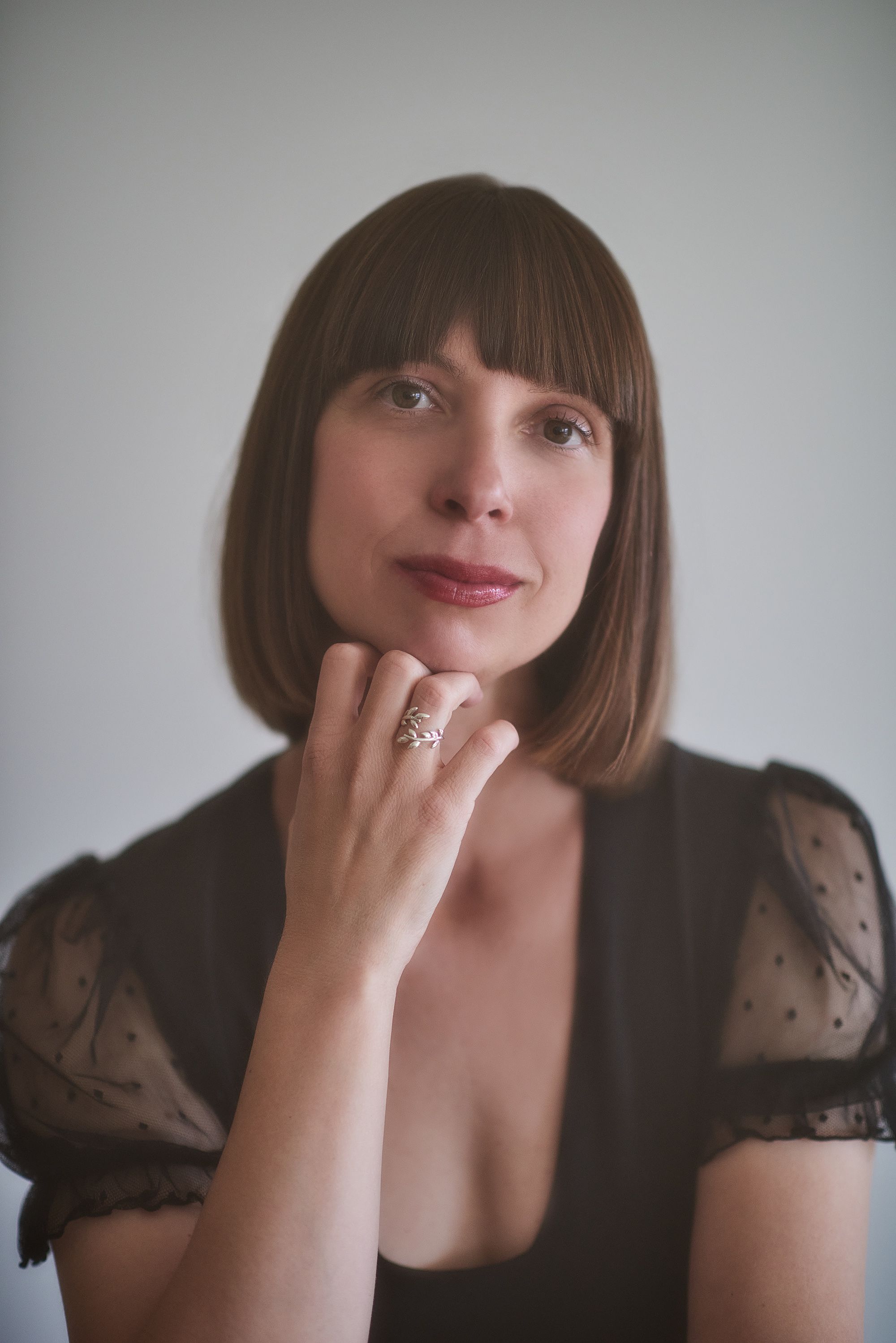
Courtney Faye Taylor

Courtney Faye Taylor is a writer and visual artist. She is the author of Concentrate (Graywolf Press, 2022), which was selected by Rachel Eliza Griffiths as the winner of the Cave Canem Poetry Prize and named a finalist for the 2023 NAACP Image Awards. Courtney earned her BA from Agnes Scott College and her MFA from the University of Michigan Helen Zell Writers’ Program. She is the winner of the 92Y Discovery Prize and an Academy of American Poets Prize. The recipient of residencies and fellowships from Cave Canem and the Charlotte Street Foundation, Courtney’s work can be found in Poetry Magazine, The Nation, Ploughshares, Best New Poets, and elsewhere.

Montserrat Andrée Carty: You work with photographs, collage, found text, yarn, and more. How do you know when words are not enough to tell the story? And, how do you land on which visual elements to bring in for a particular project?

Courtney Faye Taylor: My approach varies. I can tell you about one project and how the merging of text and image came to be in that: A while ago, I wrote a poem about the 6888th Central Postal Directory Battalion, the only all-Black, all-female unit deployed overseas during World War II. My poem amounted to a retelling of their history. I revised it several times but nothing I did brought it to that revelatory place I think a poem should go. As a way of challenging the language, I put the poem through the N+7 game. In N+7, you replace every noun in a piece of writing with the seventh noun that follows it in the dictionary. What comes of it are these strange word pairings. The strangeness made for a more inventive poem, but the poem lost some of its straightforward clarity. To reinstate the balance of concreteness and abstraction, I paired the poem with images of the battalion. To me, the images ensure that the context remains even when the language resists meaning.

In this particular project, imagery came in to support the text. Other times, I start with an image and text becomes the supporting structure. And then there are times when text and image enter simultaneously. I think it’s largely an intuitive process. I let myself be led.

MAC: In your debut book Concentrate you are covering a heartbreaking subject. In a recent talk for VCFA, the poet Patricia Smith talked of the importance of working with “emotionally prohibitive content” (things that feel too painful to write about). We often want to stay away from tragedy, but we must give it attention, right? Smith said (I’m paraphrasing), “I talk about making terrible things beautiful, and seeing the beauty in things where you’re convinced there can be no beauty.” This makes me think of your work, and I wondered if, to you, working with other elements was a way of helping you enter into this difficult material and/or to tell the story more completely?

CFT: Definitely. There’s a beauty I get to harness when I address difficult material with a multi-genre approach. I think if I were limited to one genre, I’d be limiting my storytelling, and limiting the pleasure of art-making. I want creativity to be a place of enjoyment and safety no matter how heartbreaking the subject. Though I create art to be challenged, I also create art to be relieved. And part of that relief means facing the emotionally-prohibitive content.

MAC: I recall reading that as an exercise, you’ll listen to a scene from a reality TV show and start writing down words and phrases that seem interesting and you’ll then use that in some of your work? Love that. I have a musician friend who cuts out words from romance novels, jumbles them together and that helps him write song lyrics. Is there anything else you’d like to share about your process?

CFT: I don’t have a set process for my writing. I try exercises every now and then, like the reality TV show transcription you mentioned. But for the most part, my writing is spurred by a line or image that comes to mind. It’s a spontaneous, unpredictable thing.

For visual art, my process is more determined. I’m usually called to a certain text and from there, I start creating a piece. There was a visual poem I was commissioned to make for the Jules Collins Smith Museum of Art at Auburn University. For that piece, I used Grambling State University’s 1991-1992 yearbook (a find from a local thrift store) as source material. By cutting images and text from the yearbook and collaging them together, I comment on the beating of Rodney King, the senate campaign of Klan leader David Duke, and the nature of Black student protest in the 90s. It was the found material—the yearbook—that intrigued me. From that intrigue, the work began.

MAC: Can you share some artists working in text + image who inspire you?

CFT: Kay E. Bancroft is working on a manuscript that merges text and image in really inventive ways to approach queer identity and familial history. Jonah Mixon-Webster has a moving visual/video poem called “Bait/Switch” that I’m always referencing in lectures about the power of visual poetics and the archive. Same with Diana Khoi Nguyen and the way text becomes image in her collection, Ghost Of. There are countless others. I’m thrilled to be part of a community interested in the marriage between text and image. It’s exciting to see all the ways we navigate and deepen that relationship.

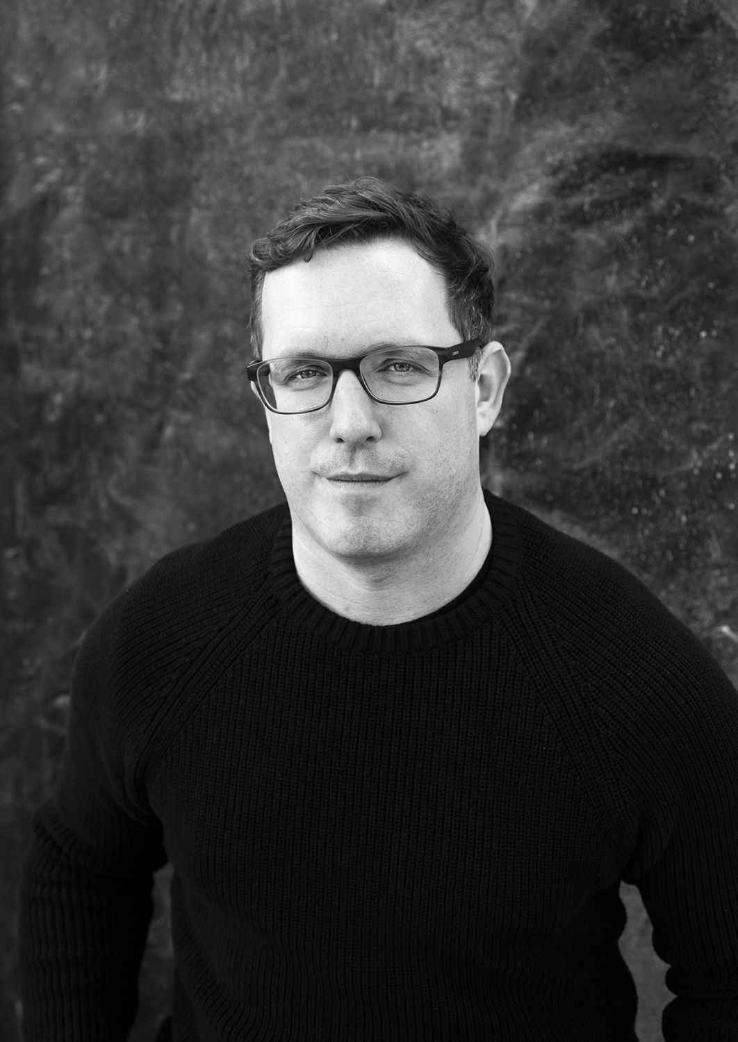
Gabrielle Bates

Gabrielle Bates is the author of Judas Goat (Tin House), named by the Chicago Review of Books as a must-read book of 2023. A Ruth Lilly and Dorothy Sargent Rosenberg Poetry Fellowship finalist, her poems have appeared in the New Yorker, the Academy of American Poets Poem-a-Day, Ploughshares, American Poetry Review, the Best American Experimental Writing anthology, and elsewhere. Originally from Birmingham, Alabama, Bates currently lives in Seattle, where she works for Open Books: A Poem Emporium, co-hosts the podcast The Poet Salon, and teaches through a variety of literary organizations, museums, and universities.

Montserrat Andrée Carty: How did you first come to integrate your visual art with your writing, and how do you sculpt a poem today when using both mediums? In short, what does your artistic practice look like?

Gabrielle Bates: When I was in graduate school in Seattle studying text-based poetry, I met the poet Catherine Bresner, and she—inspired by Bianca Stone—was experimenting with poetry comics, a genre I’d never heard of before. When I saw one of Catherine’s poetry comics projected on a screen at Hugo House, my whole body lit up like a bulb. I’d grown up drawing all the time, and I was in love with poetry, but I’d never tried to bring those two passions together into the same piece before. I instantly recognized, seeing Catherine’s work, that this poetry comic genre might be an ideal genre for me, allowing me to engage more of my art-making interests simultaneously. So I started experimenting and making some poetry comics, pairing digital collages of my drawings with text in surreal and surprising juxtapositions. I had a lot of fun with it; when I made poetry comics, I felt free to be playful. I must confess, though, that my excitement around making poetry comics fizzled out after a few years, and I’ve returned to making text-based poetry almost exclusively. Maybe I will return to those image-text experiments one day, but for now, I feel a deep and renewed appreciation for the kind of image that’s rendered through language alone. I’m not sure why that is!

MAC: You have said that poetry comics is a form “where meaning is found in integration by dwelling in the between.” I’m so fascinated by how we might reflect those feelings of being in-between spaces through the artistic forms we choose to use. I’d love to hear anything else you might like to say about this.

GB: Yes. I think the power of a poetry comic often comes from its ability to seduce, charm, beguile, or intrigue a viewer into dwelling in that in-between space, thinking and feeling and looking in the gaps. I’ve yet to meet a person on earth who doesn’t confess to feeling “in-between” in some way. And I’m interested in how the forms we use for art can give us experiences that don’t shy away from that sort of discomfort, while also giving pleasure.

MAC: In a piece for the Poetry Foundation you wrote “I maintain that poetry comics are a collaborative art, whether there is another person involved or not.” I love this. On the topic of collaboration, your visual reviews and interviews with other artists are stunning! Is there anything that you’d like to share specific to creating those?

GB: I took a hiatus from making my own poetry comics years ago, as I mentioned, but people here and there continued to reach out to solicit visual book reviews or invite me to illustrate one of their poems, and I’ve said yes whenever possible. It’s a profound honor to me, to be asked to engage with someone else’s work that way. And it’s a surprising, different way of deep reading, for sure, to draw and make art in the direction of someone else’s words. Ekphrasis in reverse.

MAC: Can you share some artists working in text + image who inspire you?

GB: Erin Marie Lynch’s forthcoming book Removal Acts (Graywolf) blows me away in every direction; I can’t wait for everyone to get to read that and experience how she’s utilizing the visual aspects of text on a page, her engagement with photographs, everything. Her book gives me the kind of chills that Diana Khoi Nguyen’s book Ghost Of does; absolute creative and intellectual brilliance paired with deep, honest reckonings of the heart. Just astounding. Other artists working in text + image who inspire me again and again are Jennifer S. Cheng (who I’ve had the great luck of collaborating with on an epistolary experiment); Bianca Stone; Catherine Bresner; Renee Gladman.

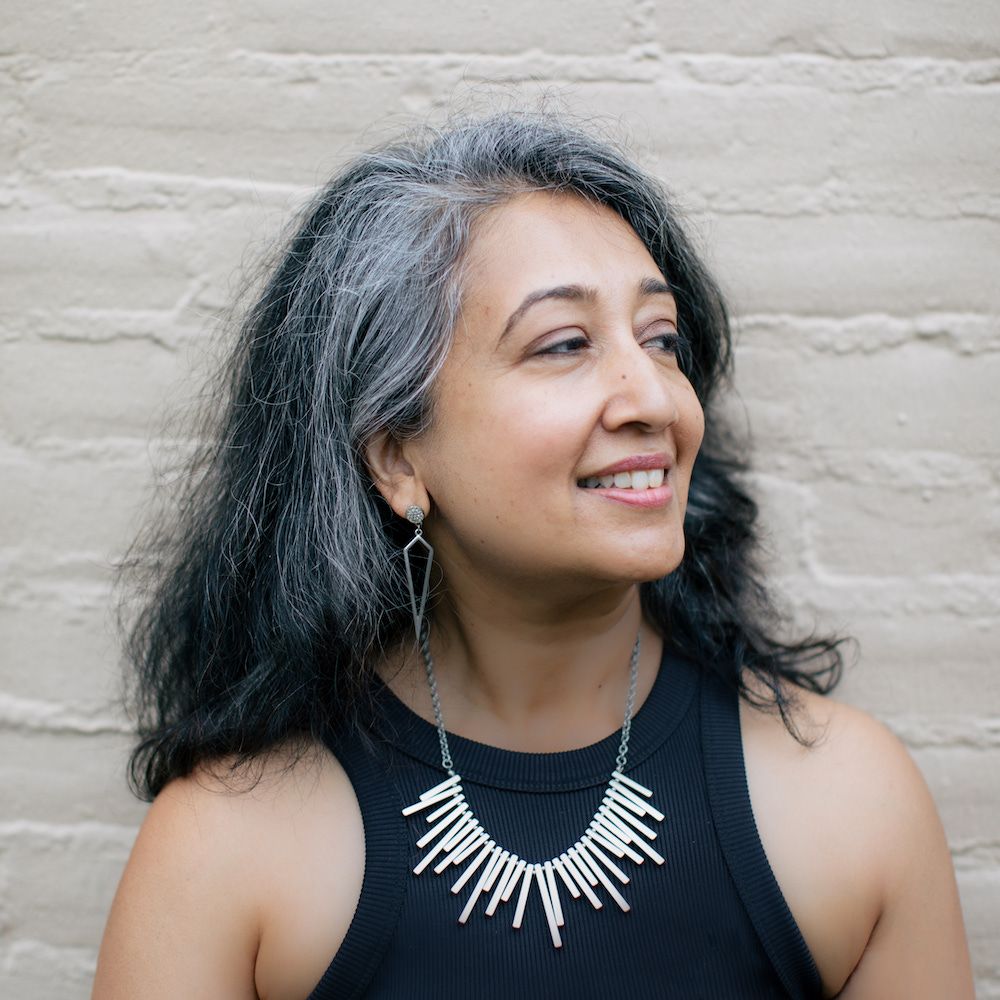
Monica Ong

Monica Ong is the author of Silent Anatomies (2015), winner of the Kore Press First Book Award in poetry. A Kundiman poetry fellow and graduate of the Rhode Island School of Design, Ong’s visual poetry innovates on text+image to surface hidden narratives of women and diaspora. You can find recent work featured in POETRY Magazine, Scientific American, Waxwing Magazine, & Asian American Literary Review.

Planetaria, her most recent exhibition of astronomy-inspired visual poetry was on exhibit at the Poetry Foundation in Chicago in 2022 and will be featured at the Hunterdon Art Museum in 2023. Ong is the founder of Proxima Vera, a micropress specializing in fine press visual poetry editions and literary art objects, many of which have been acquired by institutional collections and museums nationwide.

Montserrat Andrée Carty: How would you define “visual poetry” and how did it become your artistic practice?

Monica Ong: I think of visual poetry as an alchemy of text and image where each element participates in creating a poem's content, structure, and meaning. These elements do not echo one another like a caption or illustration would but play a role in shaping a poem's syntax and experience of feeling. I also think of it as space for play and experimentation, where we bring attention to our contexts of readings, particularly the power dynamics inherent in its various literacies, and where we can imagine more expansive ways to open up language and therefore our connection with one another.

MAC: Your book Silent Anatomies includes poetry, ephemera, archival photos, vintage medicine bottles, and even CT-scans. How did you know when words were not enough? And, how did you land on which visual elements to bring in?

MO: The first image of Silent Anatomies features a portrait for "Bo Suerte," which had originally been exhibited as a stand-alone visual collage for years. However, the image by itself was not able to convey the secret it held. A viewer might not be able to tell that the boy with flowers at his feet was actually my mother who was dressed as a boy for the family portrait. My grandfather had insisted on her boyish haircut and attire so that the portrait would show off three sons instead of two—he didn't want to lose face due to his perceived shame of having so many daughters. In this case, it is the text that does the work of revealing the truth that has been altered from the image.

Many of the visual elements in Silent Anatomies are from my family archive, which includes portraits of many kin, old cookbooks, and papers, as well as found medical images that I would come across in rummage sales or thrift shops. I scan what I am drawn to and also look for objects to create a space to write in, like a medical diagram or a medicine bottle. Sometimes I study the typography of the originals and then design something that emulates the aesthetics of that context of reading. These set up a very specific space to write, perhaps the way a prompt might. Then I look at my ancestors and write with them.

MAC: Let’s talk about your stunning astronomy-inspired visual poems! Of your poem "Purple Forbidden Enclosure" you write: “This visual poem rewrites the constellations of the Chinese northern celestial pole from a female gaze, framing each asterism as a stop on a precarious map of womanhood.” Tell us more about that!

MO: In the Chinese night sky, the Purple Forbidden Enclosure is situated in the celestial North Pole and is marked by two curved asterisms (small constellations) that look like a large pair of parentheses ( ), called Left Wall and Right Wall. This enclosure is made up of stars named after powerful ministers, guards, and officials in the emperor's court, representing his walls of power and military might. Within the enclosure are stars representing the royal court with the Great Emperor of Heaven's seat near the North Star. This historical depiction centers the night sky around one powerful man.

I rewrote Purple Forbidden Enclosure such that the walls became a representation of a woman's womb, which plays on the contrast of scale in the sense that the Great Emperor becomes a soul like all souls, who like everyone else "must be granted passage / to touch the shore of this life / and the next," now a small star nested within the immense gates of motherhood. I selected names of asterisms both inside and outside the enclosure to write about the precarity and power of this closely guarded bed of womanhood, where "She is the pillar holding up / this portal to the earth." In this version of the sky, our survival depends on our willingness to uphold and honor each other in a way that pushes back against patriarchal hierarchies.

MAC: Your visual poem "Seagull" caught my eye immediately for its beauty. In this poem, the shape directly mirrors the subject. Can you share a bit about your process of shaping your poems visually to echo the words? (Or anything else you’d like to share about your process!)

MO: "Seagull" begins with "It is I, Seagull," the first words uttered by the first woman in space, Valentina Tereshkova in 1963 who was aboard the Vostok 6 on a solo mission. The design is inspired by a collage from a dossier The Crystal Cage: Portrait of Berenice by Joseph Cornell that was published in View, in 1943. Rather than arranging the portrait within the shape of a tower of text, which suggests damsels in captivity, I modeled the shape after a NASA SLS rocket. I also designed the text as something to be read and also more dynamic as the words dance with migrating birds. While Cornell's Berenice was an imagined astronomer in a static crystal "cage," I wrote this work with a portrait of a child from my parents' birthplace, thinking of those who were the "firsts" to emerge - into space, from their families, from homelands towards new trajectories. It is through the typographic composition and design that the cage is disrupted to suggest the momentum of accelerating against constraints towards that moment of lift.

MAC: You have a text + image newsletter, and are the founder of Proxima Vera. Is there anything else about that, or other text/image resources you might like to share with our readers?

MO: To follow studio news and see what inspiration I'm looking at, subscribe to my Text+Image newsletter - it's one way I like to stay in conversation with our unique community. During the pandemic, I founded Proxima Vera as a way to bring limited edition works to audiences including special collections libraries. Certainly, I had a lot to learn about starting a small business but thanks to the Assets for Artists program via MassMoCA, I was able to do a lot of professional business development through their workshops and mentorship.

As for publishing resources, I made a little compendium of hybrid literary magazines that are open to visual poetry. You can find that here. Of course some things might have changed since then but it's been heartening to see interest in multi-modal poetry flourish in recent years.

Montserrat Andrée Carty

Montserrat Andrée Carty

Interviews Editor

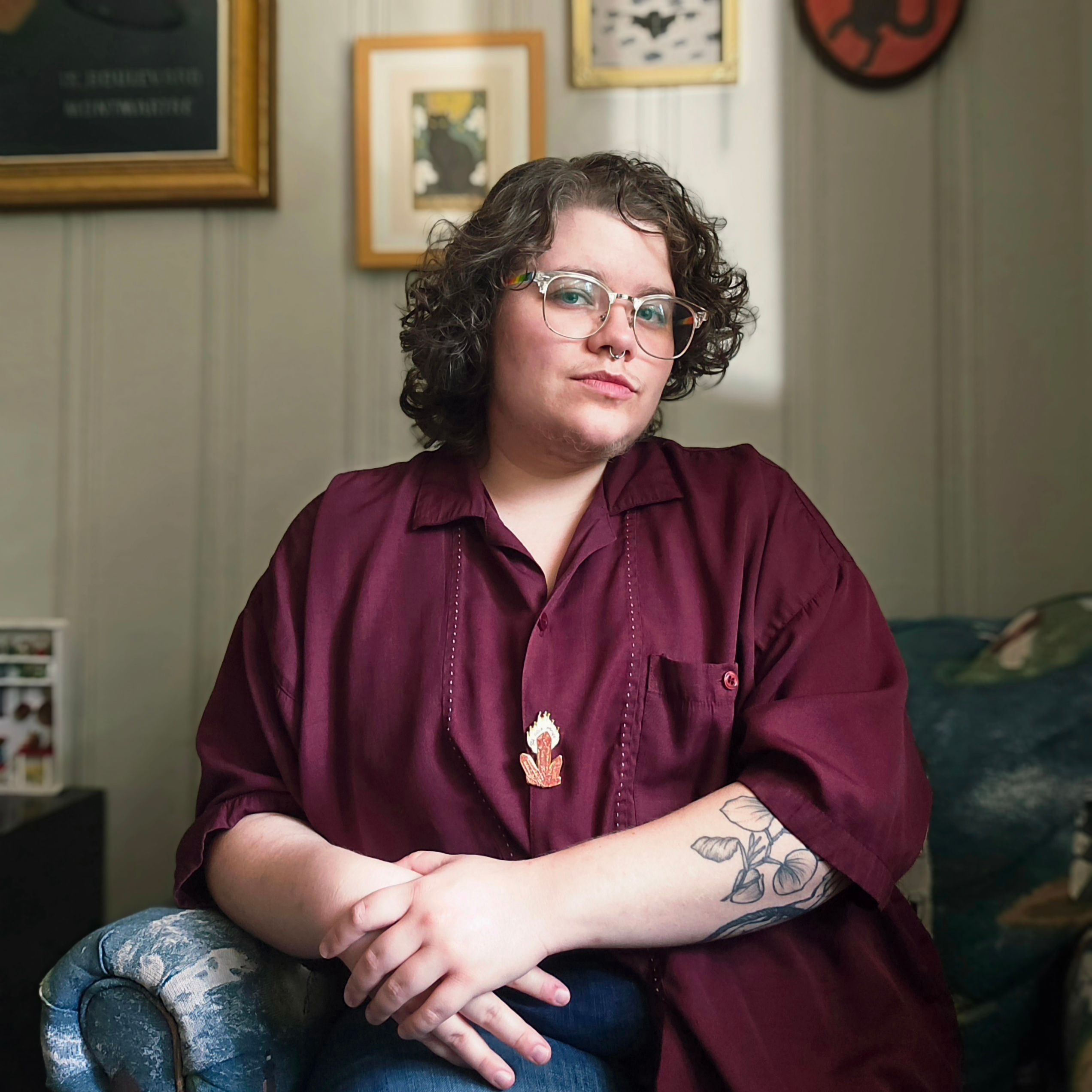
Montserrat Andrée Carty is a Spanish-American writer, photographer, and the Interviews Editor for Hunger Mountain. She holds an MFA in Writing from Vermont College of Fine Arts and is working on her first book. Find her online at www.montseandree.com.

paper texture
paper texture